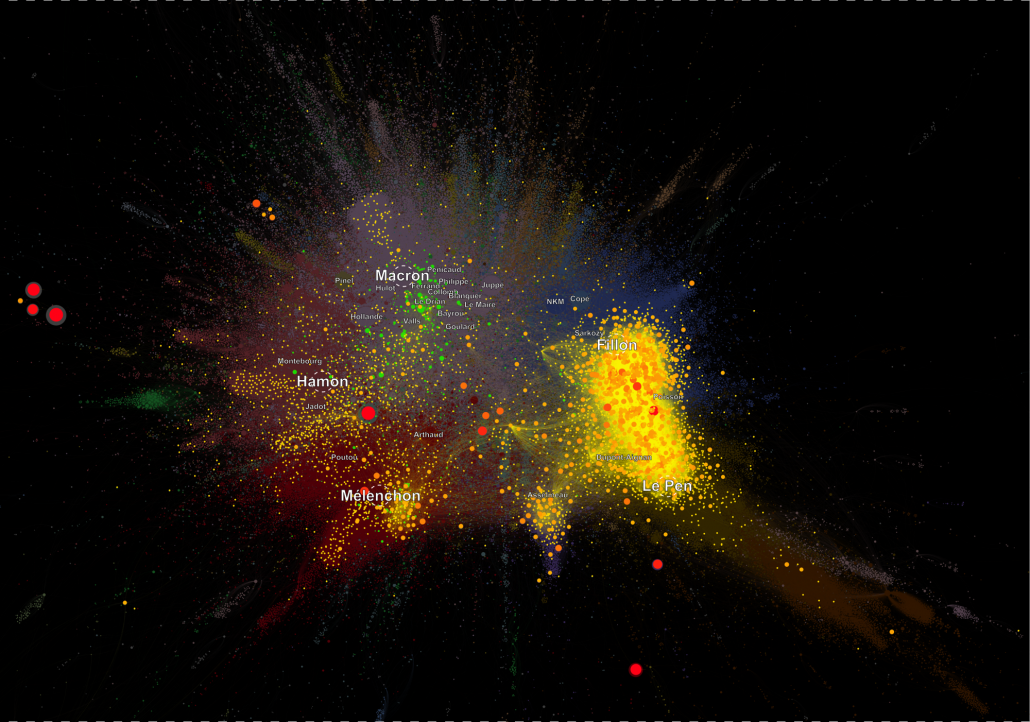
In our last paper (Gaumont et al., PLoS ONE) we analyzed the diffusion of fake news referenced by the Le Monde newspaper in the French political Twittersphere. These two pictures show their diffusion on two different maps : the 2017 map, the map of the political landscape on the eve the the 1st round. Diffusion of fake news and their debunks are overlayed on these maps.
Political French Twittersphere computed on the period Feb. 2017-Apr. 23 2017 with overlay of colors indicating Fake news diffusion (in yellow to orange) and the corresponding debunks (in green). The list of fake news have been taken from the Le Monde Journal (les Decodeurs). It is not exhaustive, but clearly demonstrates the extreme polarization that fake news generate. This has been documented in our paper : if at the account level fake news reach on average more account than debunks or standard news, the effect is reversed at the community level : fake news reach less communities than their debunks and other news. Licence : CC BY-ND 4.0 CNRS Chavalarias D, Panahi M. & Gaumont N. 2018
Political French Twittersphere computed on the full year 2017 with overlay of colors indicating Fake news diffusion (in yellow to orange) and the corresponding debunks (in green). The list of fake news have been taken from the Le Monde Journal (les Decodeurs). Licence : CC BY-ND 4.0 CNRS Chavalarias D, Panahi M. & Gaumont N. 2018


